Case Study: L&H Industrial
In 2014 L&H decided to launch a major marketing effort alongside their 50th anniversary. As a global leader in design and manufacturing of heavy machinery they needed a website that would live up to the expectations of everyone involved.
Branding and Design
The entire marketing strategy was laid out by Warehouse Twenty One, including the ambitious branding overhaul to be launched on L&H’s 50th year of business.
Working in partnership with L&H, Warehouse Twenty One (W21) rebuilt the brand from the ground up, crafting a distinct company voice and clearly defining and articulating a modern corporate character complete with reimagined logo imagery. We delivered a sophisticated brand experience that captures their core identity and serves notice to the competition that L&H has arrived on the world stage. Warehouse Twenty One
Building Blocks
The custom theme was built as a modified Bones theme. Asset compilation (Sass, style/script minification) was done using Prepros. The backend content controls were built out using the ACF PRO plugin. Custom plugins were created for custom post types, shortcodes, tech sheets (more on these later), and widgets.
Site Structure
The banner section required flexible controls for a variety of use cases. Depending on the page the banner could be a single image or a slideshow, feature specific items, include search capability, lists of services, or custom HTML code. The ability to customize the mobile experience for particular banners was available as well.
While enabling these capabilities the interface had to be intuitive, since the client would be creating new pages and updating regularly. With this in mind, tabbed sections were created to divide capabilities into relevant groups and conditional display of items, to eliminate clutter, were implemented. Automatic behaviors, such as banners turning into slideshows if more than one image is selected, keeps unnecessary clutter to a minimum as well.
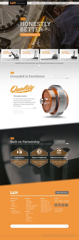
Use of subtle animations were added to direct user focus on certain interactions. It’s easy to go over-the-top on these, so keeping them low-key and snappy prevents them from interrupting user flow.
Triggered Animations
Certain elements needed to trigger based on user scrolling, and for that the Waypoints JavaScript library was used.
Custom Icons
There were quite a few elements sprinkled throughout the site that would benefit from being implemented as an icon font. Primarily these were elements that needed a hover state, such as links or buttons with icons. As an icon font it’s straightforward to apply CSS styles to change colors and adjust sizes as needed. The issue with including an entire icon font set (such as Font Awesome), however, is the number of fonts you don’t use is greater than those you do. This results in unnecessary bloat and delay on the site.
On sites like this my go-to solution is IcoMoon which allows you to select a subset of popular font icons, or upload your own SVG files to be converted into a font.
Internationalization
Custom themes and plugins I build implement internationalization because I never know where they’ll end up, or what the client’s future needs may be. Typically it’s easier to implement this while building a theme/plugin, rather than tacking it on later, and the time added is negligible.
For the L&H site two versions would exist, English and Spanish, so the additional step was taken to generate the files needed for translation using Poedit. These files were then handed off to translators and incorporated back into the site before launch. Then depending on the site language the proper text for the custom theme/plugins would be displayed.
Product Tech Sheets
Information about each L&H product exists on its own page on the site. However, L&H also wanted downloadable tech sheets available for sales reps and interested parties based on this content. These tech sheets were built out using custom PDF templates using mPDF to fill in dynamic elements and images.
The advantage of using mPDF is that it supports some HTML and CSS, along with custom fonts, to allow creation of more on-brand PDFs using existing skills.
Multisite
In addition to the separate language versions of the site, separate domains needed to be set up for the US, Mexico, and Chile. To manage these sites WordPress Multisite was implemented along with domain mapping for separate domains to each site.